Kliknij, aby powiększyć
Trainer SaaS Landing Page
Landing pages
Claude 4 Sonnet
Official Promptzy.Art Prompt
UI Description
Trainer SaaS Landing Page
Full prompt
🎯 Goal
Design a hero-focused landing page that introduces your SaaS to new visitors (mostly personal trainers), conveys professionalism and simplicity, and encourages them to sign up or log in.
✅ Page Sections (with Tailwind CSS layout)
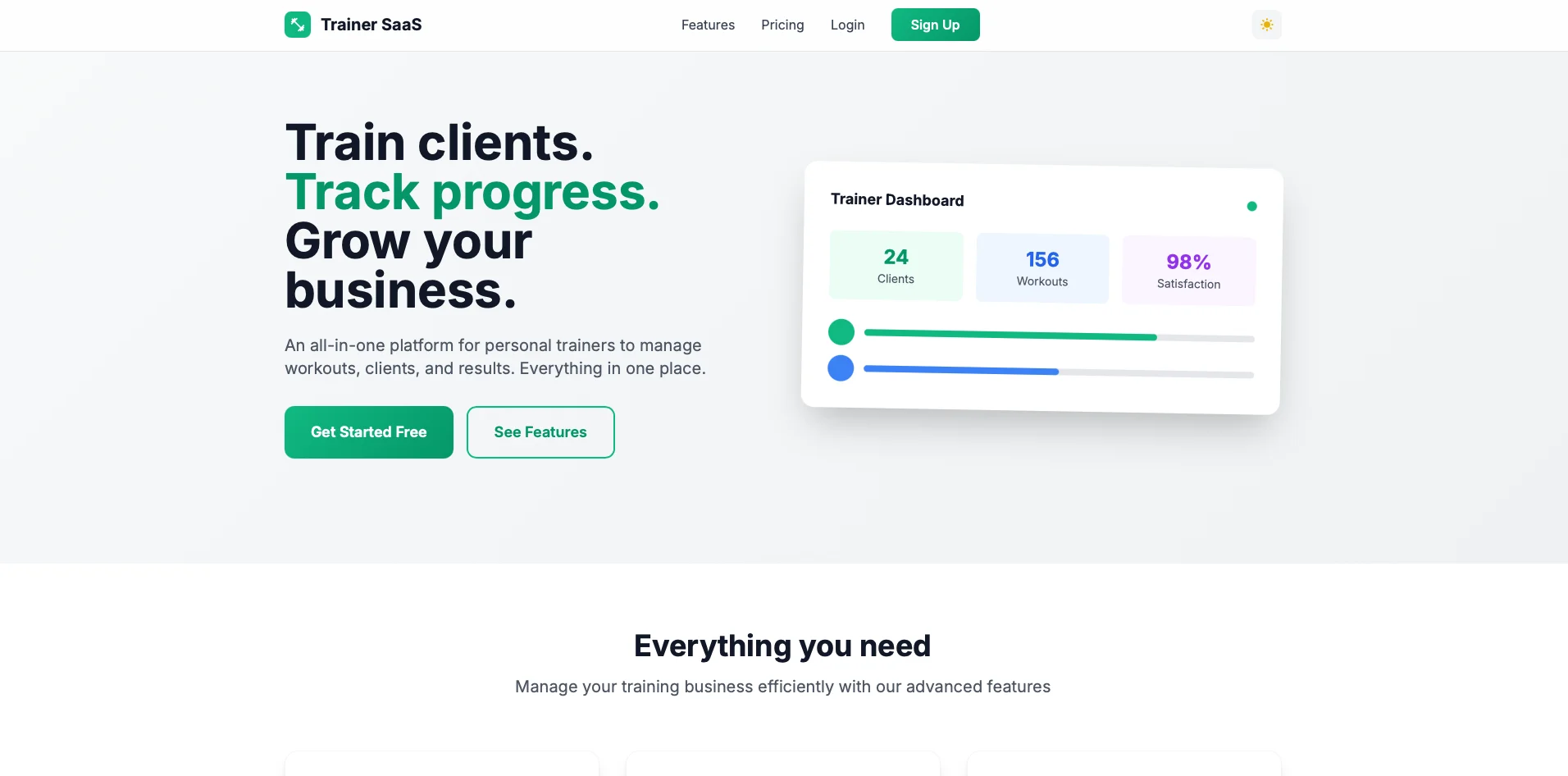
Navigation Bar
Left: Logo (text or icon)
Right: Links → “Features”, “Pricing”, “Login”, “Sign Up” (Sign Up as a primary CTA button)
Optional: Dark mode toggle in the corner
Hero Section
Headline: e.g., “Train clients. Track progress. Grow your business.”
Subtext: short pitch like “An all-in-one platform for personal trainers to manage workouts, clients, and results.”
CTA buttons: “Get Started” (primary) and “See Features”
Right side: Illustration or screenshot mockup of the dashboard (can be a placeholder)
Key Features Section
Grid layout (2–3 columns on desktop, stacked on mobile)
Each with icon, title, short text (e.g. "Workout Builder", "Client Scheduling", "Progress Tracking")
Testimonials Section (optional)
Include 1–3 testimonials from fictional trainers
Call to Action Section
Reinforce value
CTA Button: “Start Free Trial” or “Join Now”
Footer
Links: Terms, Privacy, Contact
Optional: social icons
✅ Styling Requirements
Use Inter or Poppins
Base background: #F8F9FA (or use a subtle gradient)
Soft shadows, rounded corners (rounded-2xl)
CTA buttons in emerald, sky, or rose palette from Tailwind
Clean white cards, consistent padding, hover animations
Mobile-first with excellent responsiveness
✅ Bonus UX Features
Dark Mode toggle
Smooth scrolling to anchor links
All buttons have clear focus/hover/disabled states
Icons via Heroicons or inline SVGs