Kliknij, aby powiększyć
Photographer Portfolio
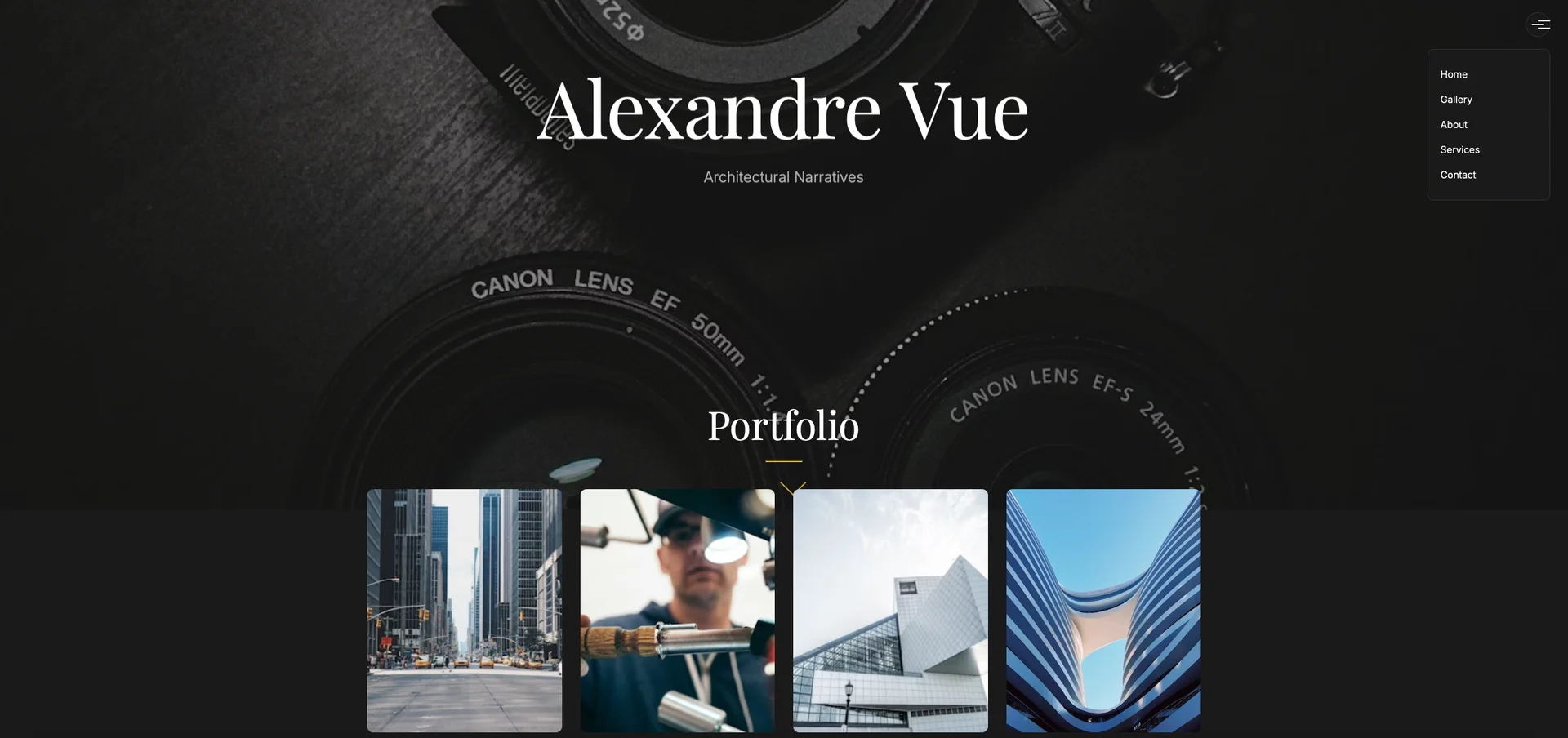
Portfolio
Claude 4 Sonnet
Official Promptzy.Art Prompt
UI Description
truly creative and modern "OnePager" HTML UI theme for a photography portfolio
Full prompt
[PROMPT START]
**Project Goal:** Generate a fully responsive, modern, and highly creative HTML UI theme for a "OnePager" photography portfolio. The design must include a unique custom cursor and prioritize showcasing high-quality photography with an artistic and immersive user experience.
**1. Core Concept & Mood:**
* **Theme Name Suggestion (for inspiration):** "Luminar Focus," "Aperture Edge," "Chroma Canvas"
* **Overall Vibe:** Sophisticated, minimalist yet impactful, artistic, cinematic, immersive, elegant, and slightly unconventional. It should feel like stepping into a curated gallery.
* **Emphasis:** Visual storytelling. The design should enhance the photography, not overshadow it.
**2. Target Audience:**
* Art directors, potential clients (commercial/private), gallery curators, fellow photographers, and enthusiasts of fine art photography.
**3. Structure & Layout (OnePager - Scroll-Based Sections):**
* **Overall Flow:** A seamless vertical scroll experience, with distinct sections that transition smoothly. Consider subtle parallax effects or scroll-triggered animations between sections.
* **Navigation (Optional but recommended for accessibility):**
* A very minimalist, perhaps initially hidden or icon-based navigation menu (e.g., a sleek hamburger icon that opens a simple list of section links like "Home," "Gallery," "About," "Contact").
* Alternatively, subtle dot navigation on the side of the page that indicates scroll progress and allows jumping to sections.
* **Section Breakdown:**
* **A. Hero Section (Above the Fold):**
* **Purpose:** Immediate impact, introduce the photographer.
* **Content:**
* A stunning full-screen background image or a subtle, looping background video (muted) showcasing the photographer's best work or style.
* Minimalist text overlay:
* Photographer's Name (e.g., "Alexandre Vue" or "[Your Name Here]") - elegant typography.
* Tagline or Specialization (e.g., "Fine Art Portraits," "Architectural Narratives," "Ephemeral Landscapes") - smaller, complementary font.
* A subtle call-to-action or scroll cue (e.g., an animated arrow pointing down, or the custom cursor changing to indicate scrollability).
* **Design:** Cinematic, uncluttered, high emotional impact.
* **B. Gallery/Portfolio Showcase Section:**
* **Purpose:** The heart of the portfolio. Display a curated selection of best works.
* **Layout Options (prioritize creativity and modernity):**
* **Asymmetrical Masonry Grid:** Images of varying aspect ratios fitting together beautifully. Generous spacing.
* **Horizontal Filmstrip Scroll:** A section where users can scroll horizontally through a series of images. Each image could have a subtle hover effect revealing a title or brief description.
* **Full-Bleed Overlapping Layers:** Images presented in a layered, slightly offset manner, creating depth. Clicking an image could bring it to the forefront or open a lightbox.
* **Interactive Grid with Hover Reveals:** A seemingly simple grid where hovering over an image reveals a color overlay with the project title and a "View Project" link/icon, or perhaps subtly animates the image (e.g., slight zoom, desaturation to color).
* **Image Interaction:**
* Clicking an image should ideally open it in a full-screen, distraction-free lightbox viewer with easy navigation (next/previous arrows, close button) and optional caption display.
* The custom cursor could change when hovering over gallery items (e.g., to a magnifying glass, an eye icon, or a plus sign).
* **Content:** Placeholder for 10-15 high-resolution images. Show variety if applicable (portraits, landscapes, abstract, etc.).
* **C. About the Artist Section:**
* **Purpose:** Connect with the viewer on a personal level.
* **Content:**
* A professional, yet approachable photo of the photographer (optional, but good for connection).
* A brief biography/artist statement (2-3 short paragraphs). Focus on passion, philosophy, and unique approach.
* Optionally, a list of notable clients, publications, or awards (if applicable, keep it concise).
* **Design:** Clean, legible typography. Could be a two-column layout (image on one side, text on the other) or text elegantly flowing around an image. Maintain the sophisticated feel.
* **D. Services/Commission Section (Optional but good for professionals):**
* **Purpose:** Clearly state what services are offered.
* **Content:** Brief descriptions of services (e.g., "Portrait Sessions," "Commercial Photography," "Event Coverage," "Fine Art Prints").
* **Design:** Minimalist icons accompanying each service could be effective. Clear call-to-action if interested (e.g., "Inquire About a Project").
* **E. Contact Section:**
* **Purpose:** Easy way for interested parties to get in touch.
* **Content:**
* A simple contact form (Name, Email, Subject, Message).
* Direct email address.
* Links to social media profiles (Instagram, Behance, LinkedIn, etc.) using subtle, modern icons.
* **Design:** Integrated seamlessly. Not just a tacked-on form. Could be visually interesting, perhaps with a background image from the hero section blurred or darkened.
* **F. Footer:**
* **Purpose:** Copyright, secondary links.
* **Content:**
* Copyright notice (e.g., "© [Year] [Photographer's Name]. All Rights Reserved.")
* Optional: Links to Privacy Policy, Terms of Service.
* **Design:** Very understated, small font, clean.
**4. Visual Design Language:**
* **Color Palette (Choose one direction or suggest the AI to pick within these vibes):**
* **Sophisticated Dark Mode:** Deep charcoals, near-blacks, off-blacks as a base, accented with a single muted color (e.g., desaturated gold, deep teal, or a subtle silver/white for text and highlights). This allows photos to "pop."
* **Minimalist Light Mode with Artistic Accents:** Predominantly white or very light grey space, with strong black or dark grey typography, and one vibrant but tasteful accent color for interactive elements or section dividers (e.g., a burnt orange, a specific shade of blue, or a deep magenta).
* **Monochromatic with Texture:** Using shades of a single color (e.g., greys, sepias) but incorporating subtle textures or gradients to add depth.
* **Typography:**
* **Headings (Photographer Name, Section Titles):** A modern, elegant sans-serif (e.g., Montserrat, Open Sans, Lato, Raleway with distinct weights) or a sophisticated serif (e.g., Playfair Display, Lora, Merriweather) if it fits the mood. Choose something with character but highly readable.
* **Body Text (Descriptions, About text):** A clean, highly legible sans-serif that pairs well with the heading font. Ensure sufficient contrast.
* **Font Sizes & Hierarchy:** Clear visual hierarchy using font weight, size, and spacing.
* **Imagery Style (within the portfolio):** The UI should be designed to complement high-quality, professional photography. Assume images will be sharp, well-composed, and color-graded.
* **Iconography:** If used (e.g., social media, navigation), icons should be minimalist, clean, and consistent with the overall aesthetic (e.g., SVG line icons).
* **Whitespace:** Generous use of negative space is crucial for a modern, sophisticated feel. Avoid clutter.
**5. Custom Cursor Details:**
* **Concept:** The cursor should be an integral part of the design, not an afterthought. It should be subtle yet engaging.
* **Default State:** A small, clean dot or a slightly larger, semi-transparent circle, or perhaps a custom-designed minimalist shape (e.g., a subtle crosshair, a tiny abstracted aperture symbol).
* **Hover States:**
* **On Links/Buttons:** The cursor could expand, change shape (e.g., dot becomes an underline, or circle encapsulates the text), invert colors, or reveal a subtle textual cue (e.g., "View," "Open").
* **On Gallery Images:** Cursor could transform into a "View" icon, a magnifying glass, an eye icon, or a specific shape that indicates clickability for a lightbox.
* **On Draggable Elements (if any, like a horizontal scroll gallery):** Cursor could change to a "grab" or "drag" icon.
* **Trailing Effect (Optional):** A very subtle, smooth trailing effect for the cursor movement, but not overly distracting.
* **Color:** The cursor should have good contrast against both light and dark backgrounds if the design uses both, or adapt its color.
**6. Interactivity & Animations:**
* **General:** Animations should be smooth, subtle, and purposeful – adding to the experience without being jarring. Use CSS transitions/animations primarily.
* **Scroll Behavior:**
* Smooth scrolling is a must.
* Subtle fade-ins or slide-ins for content as sections scroll into view.
* Consider a sticky header (if navigation is present and not hidden).
* **Hover Effects:** Beyond the cursor, elements like gallery thumbnails or buttons should have subtle hover effects (e.g., slight scale-up, shadow change, color overlay, border appearance).
* **Page Load/Transitions:** A quick, elegant preloader animation (e.g., the photographer's initials animating, or a simple geometric animation) that transitions smoothly to the hero section.
**7. Key Creative & Modern Elements to Emphasize:**
* **Asymmetry:** Don't be afraid of asymmetrical layouts, especially in the gallery and about sections, as long as visual balance is maintained.
* **Focus on Photography:** Large, high-impact images.
* **Microinteractions:** Small details that make the experience delightful.
* **Intuitive UX:** Despite creativity, navigation and interaction should feel natural.
* **Typographic Excellence:** Typography is a core design element.
**8. Technical Considerations (for HTML output):**
* **HTML Structure:** Semantic HTML5 ( `<header>`, `<nav>`, `<main>`, `<section>`, `<article>`, `<footer>`, etc.).
* **CSS:** Well-organized CSS, potentially using CSS variables for easy theme customization (colors, fonts).
* **Responsiveness:** Fully responsive design that looks flawless on desktop, tablet, and mobile devices. Mobile-first approach is preferred.
* **Performance:** Optimized for fast loading (e.g., lazy loading for images in the gallery).
* **Accessibility (A11y):** Consider ARIA attributes where appropriate, keyboard navigation, sufficient color contrast.
**9. Deliverables:**
* Clean, well-commented HTML structure.
* Associated CSS (either inline in `<style>` tags for a single file, or ready to be linked as a separate file).
* JavaScript if necessary for advanced interactions (like the custom cursor, advanced animations, or lightbox), otherwise prioritize CSS-only solutions where feasible.
* Placeholders for all images and text content. Clearly mark where the photographer's name, bio, image paths, etc., should be inserted. For example: ``, `<img src="placeholder-gallery-image-1.jpg" alt="Description of image 1">`.
**10. Things to Avoid:**
* Cluttered layouts.
* Generic or cliché design templates.
* Overuse of loud colors or distracting animations.
* Poor typography choices (illegible fonts, bad hierarchy).
* Slow loading times due to unoptimized assets.
* Non-responsive design.
* Cursors that are too large, distracting, or impede usability.
Images if needed should by from no copyright websites like pixabay or unsplash